Flat-ter with Colors
September 18, 2013
When it comes to Humans, interacting with computing devices, the friendship is slightly more than two decades old. From the flow of endless text in black and green colored hypothetical screens to amazing designs of today spread across any screen size you can think of, Graphical User Interfaces have come a long way on the only available canvas; Screens.
The Genesis of Graphics
Evolution of Graphical User Interface has deep roots, not limited to merely a change of color palette in your favorite site or a new theme of latest version of your Operating System of choice, as deep as late ‘60s. The command-line never attracted masses and that was single big hindrance to bringing computers to consumers at large. Initial attempts of pointing device based interfaces done by Stanford Research Institute led to further great inventions made by Xerox PARC (Palo Alto Research Center), which was later famously adopted by Apple (and copied by Microsoft) and became a revolution.
Design, and Iterate, Iterate, Iterate
Closely looking into the avalanche of changes that have occurred to interfaces and various form-factors of devices, it is both, fast and slow. We were not used to look at screens for hours, and were not easily adaptable to work with computers. Though GUIs eradicated the need of having a “science knowhow” for using computers and added a human touch, the transition was not smooth and learning curve was steep, and that’s the reason why we have dedicated discipline of studies on Human-Computer Interaction.
To ease and comfort the users, designers started combining real world objects into the interface, having Floppy Icon for Save action, Trash Can for Delete, Magnifying glass for search, and the list goes on. People could associate the action with the design just with a glance, without having to read what it actually does.

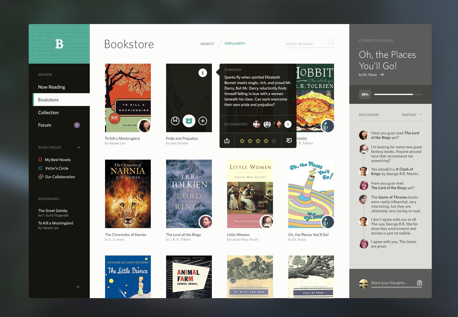
From having a sense of familiarity to being a pleasure to look at, Graphical Interfaces went through a lot of research and innovations over the years. Spend an hour on Dribbble or Behance and return back to real world, everything starts to look ugly.
Loved Hated Skeuomorphism
Defining Skeuomorphism in simplest set of words; A faux design that resembles real world objects. Be it screen buttons that look like those light switches hooked on walls of your home, a paper tear-like edges of Notepad app on your phone, and many such examples. In the beginning it added to accessibility to the users, as they could easily associate it with real world objects, and thus, they already know how to use it.
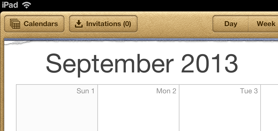
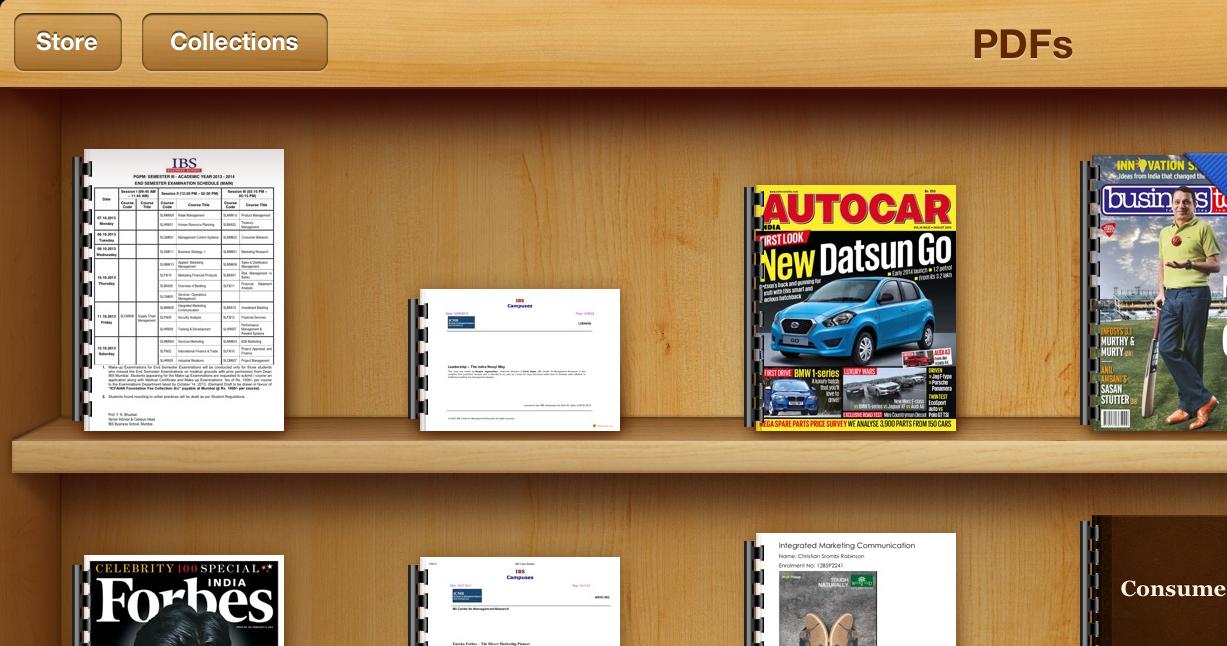
But in last two years, this design language got exaggerated on famous platforms (particularly, iOS) and unnecessary elements became part of interface, which aided absolutely nothing to usability of application, not to mention, stitched leather and fine grain wooden veneers. While many designers were obsessed with this design language (Apple played a key role behind promoting Skeuomorphic designs), a small set of designers started hating it.
There’s a thin line between smartness and dumbness of using this pattern of design, and it lies on the app idea itself, there are certain apps that still require those knobs and switches in it to express greater sense of familiarity to its user, instead of distracting them. Virtual DJ for iPad is an example that makes an efficient use of skeuomorphic design, as DJ professional knows exactly how Turntables work in real world, so operating it on touchscreen is similar, but unfortunately, not all apps in the App Store have follow same idea, and you may love to see those.
Meet the Flat
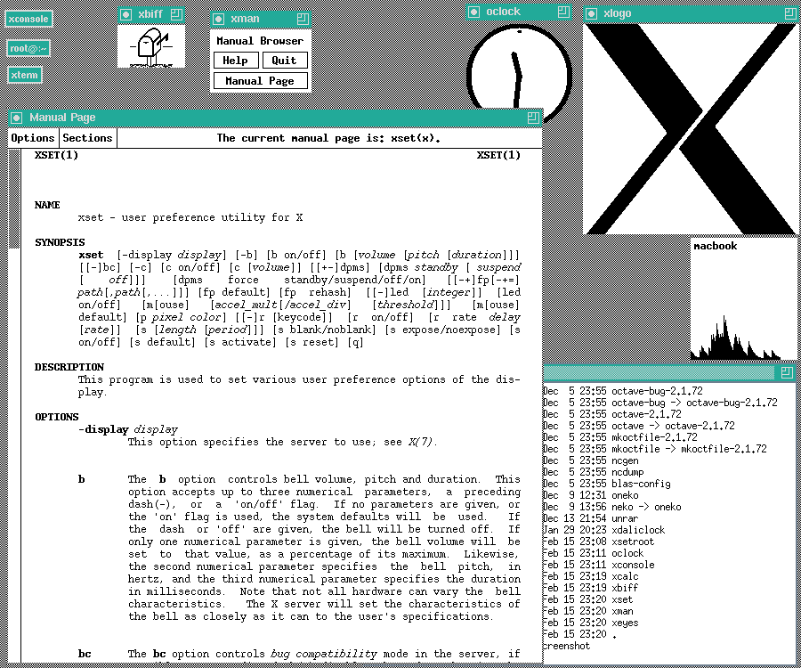
Yes, the reason of hatred is a result of our usage experience with computing devices for last 20 years. We are already familiar how a button works, since we’ve been seeing it since our childhood, so we don’t need a resemblance of real world switch. The hatred has now become mainstream, and we call it, the Flat Design (or may be, almost-Flat Design). Digging into the origins of so-called Flat design, it turns out that it is as old as GUI itself, we did have first GUIs very close to what Flat designs are today, but not as pleasant and with smart choice of colors used.
Microsoft was actually the first to re-introduce the new design language to consumer market than anyone else in the industry. It was with Windows Media Center, which Microsoft released for the first time back in 2001 with Windows XP Media Center Edition (final release in 2002) to make way for computers into your drawing room from your boring office desk.
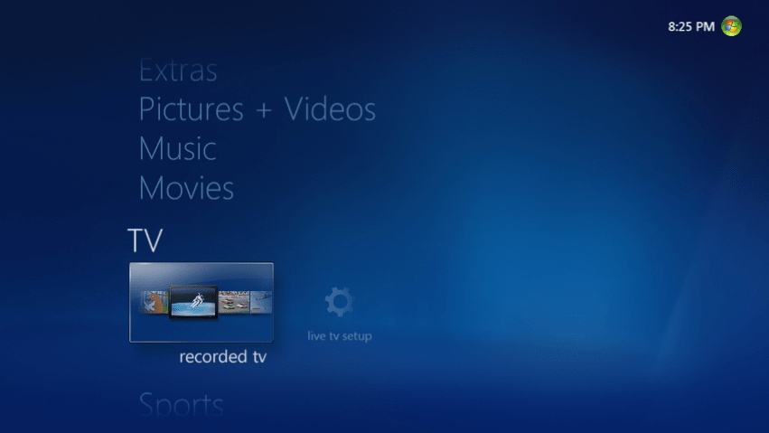
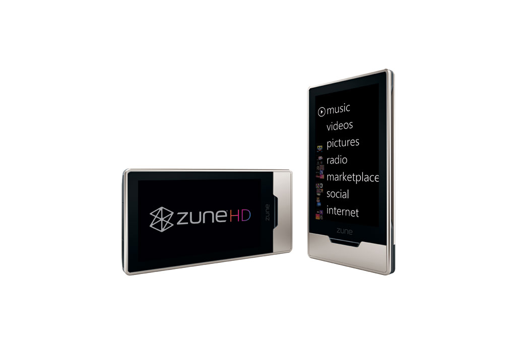
But for almost a decade, this design language (dubbed as Metro Modern UI) remained boxed in Media Center, though Microsoft implemented it again on their Xbox Gaming Console and Zune HD Music Player (sounds familiar), it didn’t make into Microsoft’s flagship products. But Metro UI had a potential, huge potential, or at least Microsoft believed it.
With the launch of Windows Phone (or rather a rename/rebrand of Windows Mobile) back in 2010, Microsoft was not only betting on its own mobile platform again, it was betting company’s whole future on it, understanding the fact that Apple took industry with the storm with its iPhone and later on the iPad, while Google was steadily gaining grounds with Android, as we entered into post-PC era. Adoption of Metro UI finally made into Microsoft’s flagship products Windows and Office (2013). But what it all means for designers? Well, infinite inspiration for creating beautiful interfaces, and a few more reasons to hate skeuomorphism.
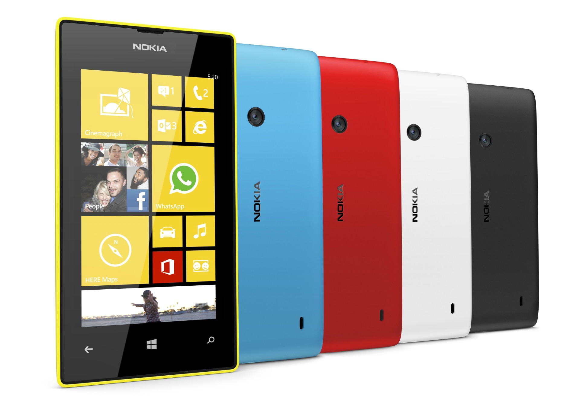
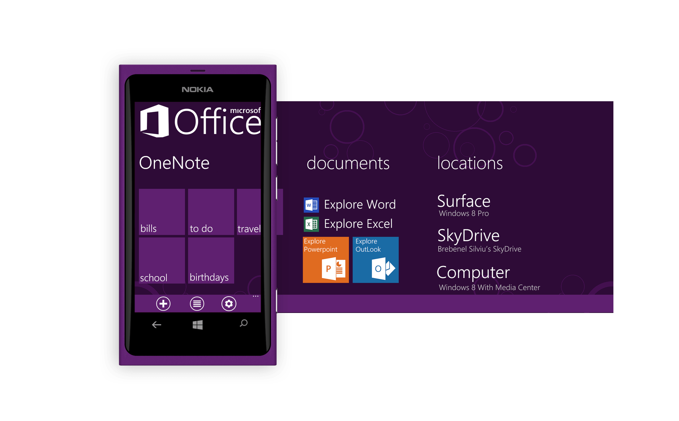
Solid colors are back into the picture, Nokia and Microsoft offsprings are great example of such. And surprisingly, this breakthrough change of great design is not coming from design demigod Apple, and what’s more it is exactly opposite to Apple’s philosophy of design that Apple had to rethink and adopt it, if not create it; the famous Scott Forstall to Jonathan Ive change.
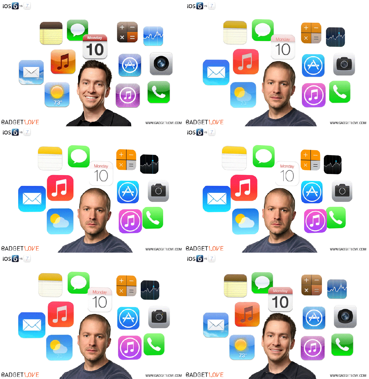
Leather-Stitch Faux, to Almost Flat, to Flat
Defining what this faux design is should be clear by now as made through this long article. But what is “almost flat”? You know how Gmail, Google Docs, newer Google Maps look like? That’s “almost flat”.
![]()
There is no presence of artificial resemblance anywhere and yet you can figure out what an icon is for; shadows are trailing yet subtle, slightly beveled edges, solid color divisions instead of gradients, and paying attention and respect to geometry. This method of design looks appealing while it is both simple and complex on its own.
Flat on the other end doesn’t even involve shadows and bevels, they focus particularly on shape and color, and that holds to true for both, Typography and Iconography, Windows Phone is all around this idea. And surprisingly, this design is not only a “visual masturbation” for designers but carry greater accessibility and usability on its own. Text is pure white on deep solid colored background, to some it looks cool, while for users with poor eyesight, it has immense readability, hitting two birds with one stone.
Up Next
Gone are those days when a functional application that serves the purpose is enough to sell and earn millions, a pleasurable user experience is equally important to keep users engaged. No matter how great your algorithm to process that large chunk of data is, if it has got shitty UI, nobody’s gonna use it, remember we’re to deal with those humans. From startups to big established companies, hirings give equal importance (or sometimes even primary) to UI/UX designers along with software engineers; Pinterest, Path and alike are great example of the same.